Report of 2009 Station Fire

The
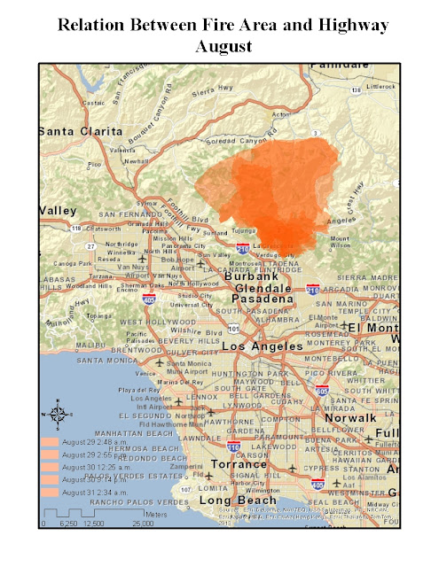
two maps above are showing the topography of Los Angeles and the extent of 2009
Station Fire in August and September. According to the maps, we can tell that the
main on fire region is the Southwest part of the Angeles Nation Forest. The
fire started on August 26 afternoon, caused by unknown arsonist, initially
ignited on the forest near the Angeles Crest Fire Station, on the Angeles Crest
Highway. The surrounding environment was very dry and in steep terrain(see the
map of elevation) cover with highly flammable vegetation, which was mature
chaparral, at least 50 years old, standing six to eight feet tall (United States Department of Agriculture Forest Service, 2009).
Finally, until it was declared contained on October 16, the station fire destroyed
89 houses, killed
two firefighters and burned more than 160,000 acres of land in Los Angeles
County (United States Government Accountability Office, 2011).
Then, I am going to talk about the threat and risk of the
station fire. Known as the largest wildfire in the history of Los Angeles
County, the station fire caused huge negative effects on residents’ properties,
surrounding public facilities and even people’s health. Fortunately, according
to the Los Angeles population density map, the on fire region has a low
population, therefore, no residents was hurt, except two firefighters. However,
since most houses in fire region are used by owners them selves, whose
household income is usually in high level, the houses were all well built and
decorated. Therefore, the cost of those 89 destroyed houses is huge.
In
addition, the fire also threaded the public facilities, such as highway, TV
signal towers and observatory on Mountain Wilson. Just like what the maps and
the government report show, the fire region is really close to the highway
nearby, once even crossed the Angeles Crest Highway (GAO, 2011). That create many problems for fire engines to get to the proper fire spot and the steep terrain also makes helicopters hard to reach the right place.
From
the other two maps, we can find that there are two TV signal towers and an
observatory on Mountain Wilson, where is really close to the fire region.
During the station fire, those facilities were under huge threat. Serious
damage could interrupt cellphone service, television and radio programming for
those who receive signals over the air, as well as some emergency law enforcement
communications (Knoll & Becerra, 2009). “A lot of people think of an
observatory as one dome, but Mt. Wilson Observatory is actually a 40-acre tract
of land with 50 to 60 buildings on it,” McAlister (2010) said. “None of that
stuff is portable, and to move telescopes out of there takes many weeks. We're
strictly at the mercy of nature and the great competence of the firefighters.”
The observatory houses multimillion-dollar astronomy projects for UCLA, USC and
UC Berkeley. Therefore, the station fire could also cause serious economic loss
the society on the fields of science research.
Last
and most important thing is about residents' health. When people expose to the
wildfire, the smoke can hurt people's respiratory tract and lead to many
sequelae. The professionals calculated that one need to pay $84.42 per exposed
per son per day to recover from the problems made by wildfire smoke
(Richardson, Champ & Loomis, 2012)
In
conclusion, the 2009 station fire put huge risk and threat on many fields of
our society including personal properties, public facilities and even human
health.
Reference
Knoll, C. & Becerra, H.
(2009). TV signals
from Mt. Wilson at risk. Los Angeles
Times.
McAlister, H. A. (2010). Diary of a Fire: The 2009 Station Fire Threat to Mount Wilson
Observatory
Richardson,
L. A., Champ, P. A. &
Loomis, J. B. (2012). The
hidden cost of wildfires: Economic valuation of health effects of wildfire
smoke exposure in Southern California. Journal of Forest
Economics,
18, 14–35.
United States Department of Agriculture Forest
Service (2009). Fire and Aviation Management Station Fire Initial
Attack Review. Report of the Review Panel.
United
States Government Accountability Office (2011). Forest Service’s Response Offers Potential Lessons
for Future Wildland Fire Management. Report to Congressional Requester.


